Whether you are going home for the holidays or staying in with a few friends, here is a visual repast to tuck into.
The work of interior designer Maureen Footer is something to savor - sumptuous, sensuous and substantive (no empty carbs here). When I first saw her blue and white tented room at Kip's Bay in 2005, it was an instant coup de foudre and I have been following her work closely ever since.

Upon meeting Maureen, one is struck by her elegance and the kind of impeccable manners that harken back to the days of starched monogrammed napkins and lunches at La Côte Basque. But what makes her endlessly fascinating in my books are her warmth and lively intelligence which are readily apparent in her rooms. Just see for yourself....

Maureen mixes the best of today and yesterday to smashing effect
Maureen was kind enough to let me grill her and share some of the secrets of la vie Footer. I hope you enjoy her thoughtful answers as much as I did.

One of the things I love about your work is that you're not afraid of color. Any general thoughts about how you like to use color?
Color and light create the emotional center of a space.

Color is the single most defining element of a space. In highly layered interiors reflecting elements of many eras, cultures and continents, modern pieces and modern conveniences (telephones, computers, and televisions, color brings unity to a room; color wraps around and embraces all in a harmonious cloak. I can’t imagine working without color.
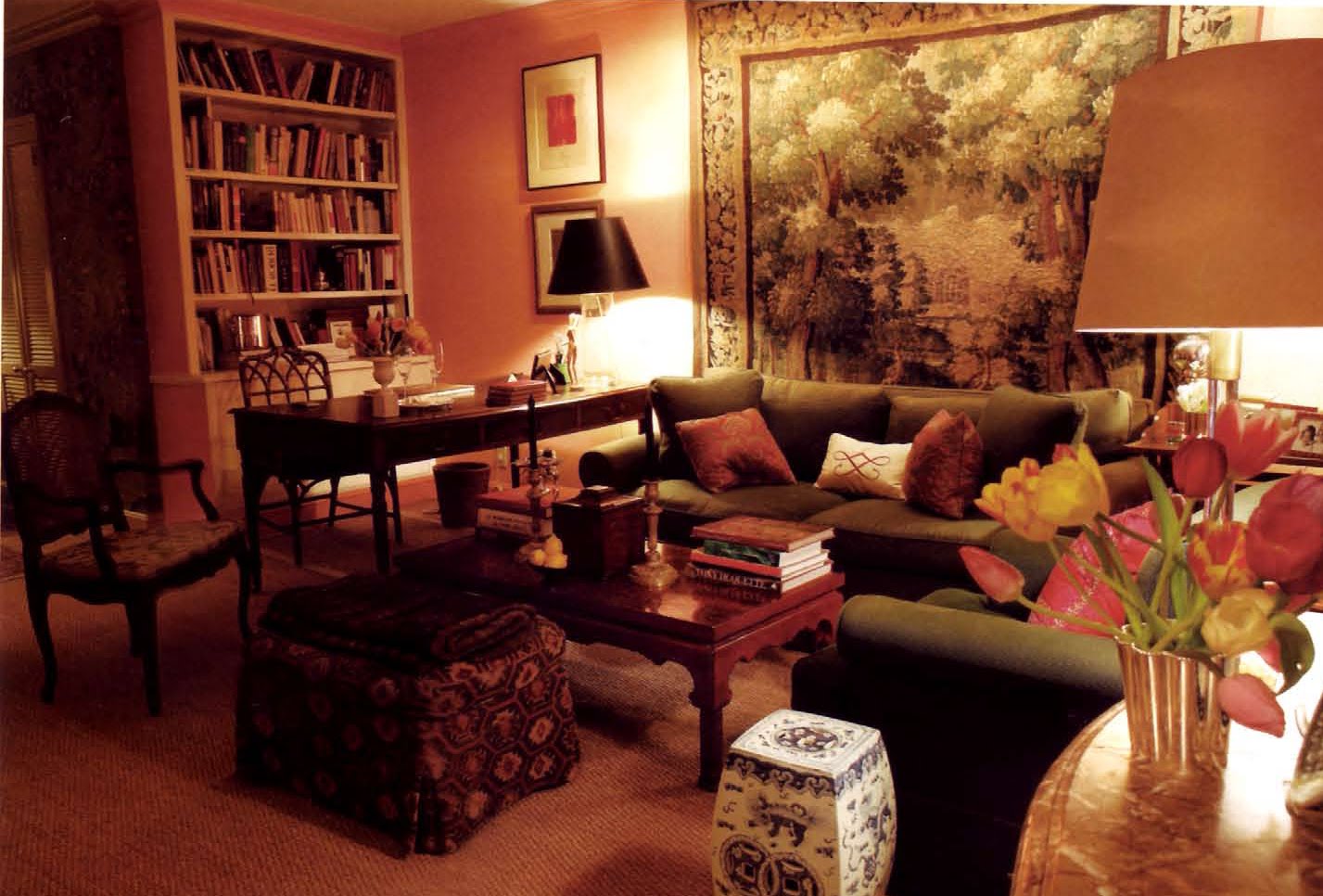
 A past rendition of Maureen's own apartment where the walls *glow*...complemented by the silver-sage and forest green of the knock-out verdure tapestry; her current scheme is chic, chic, chic - calling all magazines!
By the way, even white or beige can be a powerful unifying agent, but they must be used actively, with total commitment or they run the risk of looking like a default choice.

With a new project, where do you start? Do you build the room around one object, around a theme, a mood?
I start with the clients first of all: who are they, what they dream of attaining, what is their aspired life, what is the reality of their life , and what is the architecture they have handed me. With this in hand, I start to identify the mood we want to capture, then move on to defining a color scheme and drafting a design, including a furniture plan. After we establish this, the rest follows.
You have a deep appreciation and understanding of craftsmanship and design history - was there something in particular that inspired you to change careers and pursue design?
I have always been fascinated by interior space and how easily it can be transformed. As a girl I used to lie in bed and muse on my bedroom’s reflected ceiling plan and imagine living in my room upside down! I also continually rearranged every room in my mother’s house, to her amusement and the decorator’s chagrin.
As an investment banker at the age of 30, I was in Paris with my nose pressed against every dealer’s window in the Carré Rive Gauche. The eve of my departure from Paris I sat on the bed in my hotel room and realized my calling was to exercise that fascination with living space and make rooms for others that enrich their lives.
When you return to Paris, what are your must-stops?
Still, my old neighborhood of the 7th arrondisement and the Carré Rive Gauche are my touchstones.

a canapé chez Galerie Anne-Marie Monin
I often start with a stroll on the Quai Voltaire, with stops at Chevalier for tapestries, Anne-Marie Monin for her unerring chic eye, and of course Le Voltaire, the charming restaurant. I love Christian Béalu of J.M. Béalu & Fils and Marc Perpitch at Galerie Perpitch on the Rue de Bac. Both have a unique point of view: Bealu with porcelain and perfect sober 18th century pieces, Perpitch with items from the Louis XIII and Louis XIV époques, tapestries, walnut tables, vasques, etc. Every dealer on the Rue de Lille and Rue de Beaune harbor absolute gems too. Further down the Seine there is, of course , Kugel.
Do you have a favorite period style?
For years my answer would be the period of Louis XV. It was a sophisticated, intellectually curious, and lighthearted time relative to the more rigid, formal era of Louis XIV and the deeply troubled time of Louis XVI. I can’t look at the furniture of the Louis XVI era, even some exquisite piece by Riesener, without feeling a foreboding of events to come. Louis XIV design is grand and balanced, but lacks the joie de vivre so inherent in the time of Louis XV.

The era was aesthetically defined by the elegant Madame de Pompadour, a cultivated, witty, lady of letters (protector of Voltaire, commissioner of the first encyclopedia); patron of the arts (champion of Gabriel, the great architect, commissioner of Le Trianon) and intellectual force behind the French dissemination of the excavations of Pompeii and Herculaneum, which engendered the Neoclassical era.
 Louis XV design was characterized by the use of the sensual French curve, the rocaille. Rooms became more intimate and scaled to human life, more suitable to conversation, intellectual exchange, and human interaction. We find the loveliest, most optimistic colors during this time—the beautiful roses, blues, greens that we still see mirrored in Sevrès porcelain.

Furniture responded to the rooms and social climate, becoming smaller, more luxurious, more comfortable, more adapted to human use. The design elements were just perfect-- marquetry is exquisitely rendered and fanciful, often floral or the elegant diaper (aka lattice) pattern; ormolu mounts are curvy, flowing, sensual . How can you not adore a period which produced Bernard van Risenburgh, Vandercruse-dit-La Croix, and Migeon, the most restrained, elegant craftsman of all?

Maureen's Migneon commode - one of her favorite pieces in her own collection (if unfairly asked to choose!)
And yet suddenly I am drawn to the 17th century Roman palazzo and its interiors.

Art and design in Rome have always been such reflections of the cosmopolitan influences that continually have shaped Rome . In the 17th century, baroque Rome attained a golden age. Rome was the center of the political, art, religious, intellectual and commercial world. There was no more worldly, sophisticated, sensual, adaptive design than what we see in Rome at this time.

the inlaid marble floor at the Pantheon
When I was in Rome this summer visiting friends at the American Academy, I couldn’t stop looking at Roman floors---at the Villa d’Este, the churches of Il Gesu, Borromini’s elegant San Carlo alle Quatro Fontane, the Pantheon --they encapsulated all that Roman history in their very design, their sources of material, their grandeur and again, a sensous delight in life. Stay tuned…this is very much in my current thoughts on design!
Do you have a favorite historical house?
Madame de Pompadour’s Chateau de Champs-sur-Marne.

It is light, carefree, elegant, beautifully scaled and not at all pompous. And it has some of the most charming singerie panels I have ever seen. I just love those monkeys imitating courtiers—they represent the ultimate in light-hearted sophisticated self-deprecation.
Who are your style/design icons?
Are you surprised if I say Madame de Pompadour? Also Madame de Montespan for her famous sumptuous looks combined with her celebrated diction and wit.
More recent icons are Vanessa Bell, Virginia Woolf’s sister, for her joyous, all-encompassing approach to life and interiors.

Vanessa Bell painted by Duncan Grant
I was also smitten when I saw photos of Jackie Kennedy’s Georgetown house in the 1950s in the Sotheby’s catalogue for her sale;the house had the warm, off-hand, layered grace that makes a successful room.
 Ava Gardner's Madrid apartment by George Stacey
I researched George Stacey a few years ago for a project I was working on and was so impressed with his use of enveloping color, his Titian-like addition of strong colors to create drama, his love of painted furniture, gilded wood, and his erudite selection of French and Italian furniture. If I were to write a book, it might have to be on the talented Mr. Stacey.
You also worked at Vogue. Do you see a connection between fashion and interior design?
I think interiors are like clothes. They are highly personal—even, intimate—reflections of the individual, who they are, where their life has taken them, how they view themselves, what they value. At best, clothes and interiors enhance and enable life to be lived at its fullest, effortlessly, elegantly.
You're always beautifully dressed - is there a certain designer you like?
Yves Saint Laurent—vintage and some of the new designs by the brilliant Stefano Pilati. Also Italians—Prada, Moschino and Valentino have produced other go-to pieces in my current closet.
 Pilati's recent take on YSL's classic Le Smoking
There are of course the non-designer essentials, too—J Crew, Tretorns, 3 Dot t-shirts.
And finally - am dying to know - you are one of the busiest people I know - how do you stay so energized and balanced???
Life is like design. The best things come when you can find that quiet interior space to edit, to distill to the important and essential, from the extraneous.

I am always trying to find those moments---in the drawing studio, with early mornings in Central Park, sometimes in my kitchen preparing food for friends, in quiet hours in my apartment to read and muse. When I can find these moments, I can do all those other wonderful, fun things with more focus and pleasure.

(Maureen also doesn't own a television which no doubt helps keep the mind uncluttered.)
I thought I would end the piece with Maureen's logo - called an herisson (translating to "hedgehog"). It was taken from an 18th century French typeface and used to close paragraphs, chapters, etc.

http://maureenfooterdesign.com/


 A past rendition of Maureen's own apartment where the walls *glow*...complemented by the silver-sage and forest green of the knock-out verdure tapestry; her current scheme is chic, chic, chic - calling all magazines!


 Louis XV design was characterized by


 Ava Gardner's Madrid apartment by George Stacey
 Pilati's recent take on YSL's classic Le Smoking