

Now we're talking.
MC Book OUTTAKE #2: an early view of the same room, c. 1952
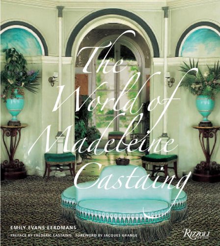
 My opinion is that Madeleine chose the ruby red velvet on the walls and banquettes to complement the verdant green foliage outdoors. It wasn't long before the red was replaced by her signature blue trimmed with her Pompeian frieze border (renamed "Lola Montez" by Edmond Petit). The borne also received a similar make-over as you can see.


21 comments:
Indeed. This is so exciting as I feel like we've been along for the ride since the beginning.
Beautiful jacket!
Very nice too that nobody tried to tidy up the drooping fringe in the cover image. I realize that interiors with an air of decrepitude were emblematic of Castaing's later years (in her prime her rooms were crisp and clean) but nothing tugs at the aesthetic heart more than the romantic effects of gravity.
Great charm and style- and I don't think tidying up would even have been possible- the paint is badly chipping and the ceiling of the alcoves look like they were done in magic marker. But the whole effect is utterly sublime.
And bright turquoise blue is that oddest of colors- so strong yet it goes with everything. Look at it with the emerald green silk(we assume) velvet on the stools. Perfection.
Next stop- Archivia to order/pre order your book. I can't wait.
Zowie!
Well done you!
It's gorgeous.
Magnus, yes, ONLY silk velvet for Madame. But I fear the final cover will be a wee more tidied up than this "before" shot... hopefully all the decrepit won't be taken out of the 'tude.
Yes! Now is this the NEW new cover? it is quite spectacular.LoveLoveLove it. This BOOK is going to have lots of godparents and a standing room only delivery room
Confused about which cover is which. But still seeing spots before my eyes. Love the girl who loves her leopard.
Madeleine Castaing is one of those French idiosyncrasies, like a love of Doris Day and Jerry Lewis, which I never could quite understand. It is 19th century, not at all my favourite period, and yet it is not ugly in the way that gaudy Victorian things are. Not my taste but it engages, fascinates and attracts. I also think the style is something, unlike Chippendale, Sheraton, and Louis XV, that Grand Rapids never appropriated so one just doesn’t see anything like it in North America. You really have to be either French or a design aficionado to appreciate and understand the look. I think for the French the look is nostalgic and cozy.
congratulations! this is so exciting!
I love Doris Day & am idiosyncratic, I am not French though one of my spinsterish great aunt's traced our lineal descent to Charlemagne so I feel French is in the blood.
Gawgeous. I first saw Castaing in Realites magazine at least 30 years ago. I nearly flipped (I do that a lot in the presence of originality and beauty, I fear. Very embarrassing) It was a real eye opener, as was the marvelous photo, since often published of her in the wig and chin strap in profile. Love the cover, love the room, love seeing an earlier version (design development and influence being a favorite topic). Can't wait to have the book---a spot is waiting right next to my copy of Regency Redux.
Down East, that Realites article is a gem and you will recognize some familiar photos for sure. Seeing the evolution really gets me going, and it was a bit heartbreaking that this photo couldn't make it in as I think it is quite important.
Emily, utterly fabulous!! I am smitten with the luxurious design.
Karena
Art by Karena
Simply wanted to say that I think the cover is perfect just as it is, and has the tender ache of heaven that one feels (no matter what nationality) when looking at the finest window Ladurée could possibly conjure up...
Always worth waiting to get things right. And this cover will, I imagine, do true justice to the contents.
I love The Aesthete's comment, by the way.
Very much looking forward to this book. That turquoise puts me in mind of Jansen's Blue Room for Mrs. Kennedy . . . KDM
It's fabulous! I am counting the days until the release!
I hd totalily forgotten about Realities magzine, but back when I was in high school, I used to have a whole pile of images ripped from its pages--and from those of Plaisir de France--and I think that must have been where I first saw Madeleine Castaing's rooms, too, although I don't think I ever registered her name till about 20 years ago. All I know is this book looks great.
Meanwhile, Emily, feel free to post any the cool pics that didn't make the cut, so that we can print them out & stick them inside the back covers once we get our copies of the book. Most of my books have bunch of loose pics interleaved between the pages.
Then it's just a matter of making sure that when we show up for Emily's book signings, we all have red leather gloves so we can spot each other in the crowd. I've got mine.
I'm arriving late to this topic but wanted to say how
much nicer, more coherent and eye catching, was
cover design No 2.
Looking forward to that book, no matter what's on
its cover.
HI EMILY-
Bravo on all the good news.
the cover--it is a winner. It has verve and originality and spirit and life. I can't wait to see this wonderful book.
cheers, DIANE
www.thestylesaloniste.com
Post a Comment