

When the Fricks and America's other bluebloods want to redecorate, they look no further than to the firm that has been refreshing their houses for generations: McMillen, Inc.
Established in the 1920s by Eleanor Stockstrom McMillen Brown, a Parsons graduate, McMillen, Inc. was a pioneer in the profession of interior decorating. Unlike many of her contemporaries, Mrs. Brown ran her practice as a business and didn't consider herself a society lady who "helped" friends with colors and curtains. She allied herself with one of her Parsons teachers, William Odom, whose refined eye and penchant for the neoclassical played no small part in her rooms that were notable for their timeless elegance, as seen below.
 Mrs. Brown's Sutton Place Dining Room
 Dining Room by Kelly Wearstler
McMillen's decorating services have been in demand through the decades, from the pool house for Standard Oil baron Colonel H.H. Rogers (father of Millicent who also used McMillen) in the 1930s to the private quarters of President Johnson in the 1960s. Mrs. Brown lived a vigorous 100 years, and came into her office everyday until the age of 90.
The latest work of Ann Pyne, a principal of McMillen, makes it clear that there is a lot more to come from the firm. This living room from a Sutton Place residence featured in the February issue of Architectural Digest is certainly traditional, but its restrained use of color and pattern make it "now".

Pyne's own New York residence is filled with an interesting mixture of family hand-me-downs and her collection of Aesthetic movement and Arts and Crafts pieces.

Pyne's own New York residence is filled with an interesting mixture of family hand-me-downs and her collection of Aesthetic movement and Arts and Crafts pieces.

My favorite room is her study, where I could happily while away hours.

Her mother Betty Sherril is the president of McMillen, seen here in her grande dame-style living room.

I got a kick out of her very Hollywood dining room, with its silvered walls and leopard upholstery. The carpeting also has the same leopard print - meow!

Credits: Top and second photo from The World of McMillen by Erica Brown; #3 http://www.kellywearstler.com/; #4 by Durston Saylor for Architectural Digest; #5-#8 http://www.nysocialdiary.com/


15 comments:
The living room is my favorite. I love anything Asian.
McMillen Brown's dining room, to me, looks fresher, tighter and more innovative than KWIDs. Doesn't it date some 75-80 years ago? And didn't she state something to the effect: if you get it right the first time, there is no need for change. True testament to well thought out, lasting design.
I love the study also. But I would be accidentally tripping over and knocking down all those stacks of books and my dog would be quietly chewing on the ones on the floor.
Soodie - I too prefer the Mrs. Brown's dining room. And you're right, it was done originally over 75 years ago which is just astonishing.
My cats do love to gnaw on the corners of books - didn't think about that!
EEE
Jill, isn't the loving room divine? - so luxuriously zen. I normally like lots of color, but am really struck by this room. EEE
Zen is the perfect word...it has a Nancy Corzine feel to me.
Great post- thank you!
I'm a huge fan of the early work of Mrs. Brown and of her husband the architect Archibald Brown. Their own houses and apartments are all fantastically chic with that strict control that ages so well. Have you ever seen the water colors of Elizabeth Hoopes- she rendered many of the interiors of Mcmillen and they are the very best of their kind! Keep up the great work your new blog is just great!
Thanks for the encouragement, JS, AND the mention of Elizabeth Hoopes. It didn't ring a bell so I opened up the McMillen book which had two of her renderings and only one in color. Just magical - will definitely be keeping an eye open for more of her work.... EEE
Jill - meant "living" room not "loving" - maybe some Freudian slip! very funny. Yes, definitely can see the comparison to Nancy Corzine.
I'll scan couple of her more amazing examples and send it to you right now....the ones in the McMillen book although beautiful are more academic. Wait till you see her more painterly stuff!! They alone are worthy of a book and I think the whole archive is at Mc Millen.
JS - once again, you are right - her archive is at McMillen - why, I wonder? Can't wait to look at the scans! EEE
One of my favorite buildings in the city.
Incredible views and sumptuous layouts.
Thanks from us at McMillen. We have a number of watercolors of Mrs. Hoopes because Mrs. Brown commissioned her to to do some of her finished rooms. We wish we had even more!
Wonderful post Emily. I think the study appeals to me most too :)
I'm glad J.S. brought up Elizabeth Hoopes' work. It's wonderful, and it needs seen in full-page reproductions, rather than the small views in the McMillen book. My big heroes in the room portrait category are David Payne & Pierre Brissaud, but EH was right up there and I was surprised to find out that it was only recently that she died in Florida. Surprised & disappointed that a simple change of name meant I never realized that she was still living, because if I had, I would have written to her to say how much I admired her work.
BTW, one of the French Moderne statues of the Four Seasons in Mrs. Brown's dining room can also be also seen--at a much smaller scale--on the terrace of one of the famous Thorne Miniature Rooms in the Art Institute of Chicago. And just in case you want a set for your own dining room, last I knew, all four figures were available through Holly Hunt at the Merchandise Mart. Seeing the figure of Spring there--fullsize--was like spotting an old friend in a crowd of strangers.
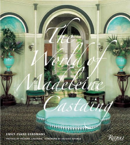
Last of all, Emily, I'm glad you've got a blog now, and I love your book. I too would have picked that that elegant black-&-white photo as the cover. The strong color contrasts of the final choice make the cover a beauty, and as an image in itself, it's great, but laid out on a big table, amidst a sea of glossily color dustjackets, the elegance & restraint of that b&w cover would have set itself apart. The same principle that worked for Coco Chanel 8O years ago still works today.
No matter, I was the first person in Chicago to get a coy of your book, as soon as it came out of the box.
Golly, Magnaverde, what great information! Ann Pyne at McMillen has kindly invited me to visit her office to look at their Elizabeth Hoopes archive - AND she interviewed Ms. Hoopes before she died - I hope to share my adventure with you soon.
Those Thorne room are miraculous - I'm thinking a blog post may be in order soon!
And I'm so glad you shared your preference for the black and white cover - I adore but adore Rizzoli, but I think sometimes the marketing department (who carry a lot of weight in these decisions) underestimates the audience - I also had to convince them people knew what "Redux" meant. Thank you for reading AND commenting - EEE
Post a Comment