
 House Beautiful, that is...
I am thrilled to announce my new affiliation with one of my very favorite magazines as a Contributing Editor. Did you know that House Beautiful is America's oldest shelter mag continuously in print since 1896? And it continues to thrive, surprise and delight under editor-in-chief Stephen Drucker's sure hand.
 bedroom by Jack Simpson from House Beautiful April 1970 - why not?
Here is a selection from the April 1970 issue, including this wild dining room in Mrs. John Duffield's London residence by Baron Alexander Albrizzi.
 "Glowing Sapphire Grotto" was the title given to this mirrored extravaganza. The geometric rug is reminiscent of David Hicks and perhaps there is a connection. Neil Zarach who formed David Hicks + Zarach had previously partnered with Albrizzi.
 Bower for a little girl by John Doktor and Burt Wayne. (Wayne and Doktor later went on to head up the Anne Klein Design Studio.)
 My "Apartment Beautiful" - Christmas 2008
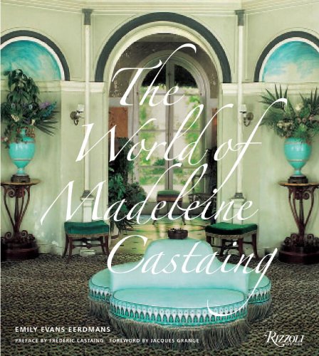
 Of course who can talk about blue without mentioning Madame Castaing? Not me anyway - I've got a book to hawk! Here in her dining room at Leves, she brought the outside in with the blue of the sky and the green of the grass which during these grey days is just what the Dr. ordered.
That and a Ramos Gin Fizz.


17 comments:
Congratulations! You are a perfect fit for HB!
Congratulations with your Contributing Editorship. I just searched for your upcoming book and saw that one of your co-authors is Jacques Grange - sounds like an ideal combiation to work with him on a book on Castaing.
Oh I love blue too-and glad you are polishing up HB! The most recent issue I have is April-all about wood, Emily it all looks like kindling. It feels as if the magazine were going to burn in my hands- an extreme turnabout from last month. I love the look of starved wood but does everything have to be the the New Look? What is wrong with a little polish? That Jack Simpson room would be a challenge, crawling on the floor or walls to get into the bed. Standing on the bed when you think it's the floor,mind boggling. I am glad you are going to be writing for HB, they need you!gaye
I finally popped into the Castaing store last week to see the famous blue that I first read about here. It did not disappoint, and Mr. FC was ever so gracious. Can't believe I never noticed it before, I must have passed by it millions of times! And it looks so nice next to the La Durée green! I wonder if your book will be available over here?
Congratulations E3 - can't wait to see what you bring to the pages of HB and am especially looking forward to the book.
Thank you all for your kind wishes!
Emile, Mr. Grange and Frederic Castaing, Madeleine's grandson, are both contributing forewords to the book. I count him as one of the most original, important living designers today and am exceedingly grateful for his help.
la, isn't the Jack Simpson room a blast? I'm still trying to understand the carpeting. Just got my April issue and will report back on all things waxy and wood anon.
House Hunting, first of all, I'm sure I'm not the only one who is jealous that you were strolling along the left bank last week - lucky you! You must remember that the color of Frederic's galerie is more green than Madeleine's famous signature shade. In fact I have a swatch of her blue and was thinking of taking it to Benjamin Moore to have it analyzed. Will definitely report back with the color code - although coming up with a formula is antithetical to her style - she surely custom mixed for the light conditions in each setting. (Laduree and its macarons - now those are inspiring!!!)
One of my favorite magazines. Congrats to you, well deserved and a perfect match.
What a heavenly combination! Looking forward to your contributions to HB. And, of course, your new book. Looks like 2010 is your most lucky year!
Mrs Duffield's DR is wild ... she's since moved on to Colefax! Far different look.
OH CONGRATULATIONS House Beautiful for choosing Emily! If I can buy it in London, I will now. I have seen people go badly wrong with with blue walls (might have done so myself once) but everything here works wonderfully. It's all in the tone.
Congratulations! LOVE HB!!
The wonderful Newell Turner and Scott sykes came to my house and photographed..love them.....love HB! I hope it will be in someday!
Madeline Castaing and her blue and green and that house at Leves........Lordy! The best!
The first time I was in Paris so many years ago; I had never heard of her and stumbled into her shop. It is a wonder I didn't have a heart attack. I loved everything; and had never seen anything like it!
She was very kind to me.
Penelope.
Congratulations! I'm so excited to see your contributions to such a great magazine.
yay,
scot
The HB blue issue was excellent, but I worry about thedomination of any single colour on the decorating landscape. Lady Colefax was quoted as saying, "In decorating, Blue is not a colour". She's been proved wrong a few times, but I think I understand her reservations. Blue is largely artificial not natural, not of the earth. And it would seem that it is precisely this element of artifice that has captured the imagination of the design world today.
You're so right about a "formula" being antithetical to MC's style. All colour is relative to light source, furnishings, adjacent rooms, etc. and must never be applied arbitrarily.
Too Beautiful! Congratulations, a great match with great things to come.
Excellent news, Emily. Stephen Drucker was smart to invite you on board. I mean, it's great to have writers & editors who know the cool new fabrics & the hottest new trends, but if that's all they know, the result can be pretty shallow, and if breathless, bouncy of-the-moment articles were enough, well, we'd still have Domino.
With you, HB gets the whole package, not only the cool factor & the humor but also the much rarer familiarity with decorative history that lets you see how the "new" trends of the season fit into the Big Picture.
I'm really looking forward to your MC book. Maybe it's time for another trip to Chicago!
that's fantastic! congratulations!
....and the honeymoon continues.
pure bliss. congrats EEE. HB is one lucky mag.
pve
Post a Comment