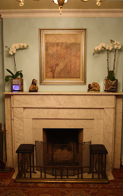
Kelly Wearstler once told me that one should think of accessorizing a room like an outfit - balancing the proportions, textures, and colors, AND that it is these finishing touches, like a great cuff bracelet or belt, that lift the ensemble to the next level.
The possibilities of 'scaping a mantel are endless. The first question may be - mirror or painting overhead? Billy Baldwin preferred mirrors...
 But I already have much too many mirrors in the room. Of course, I could follow Frances Elkins' example and just leave the wall gloriously blank....
 The Clow Residence in Lake Forest, Illinois with architecture by David Adler and decoration by Frances Elkins
But for that to work, the entire room needs to be flawlessly edited and the architectural details meticulously executed. Anyway, I'm more English County House clutter than moderne chic, so naturally I took a closer look at Mr. Buatta's oeuvre...
 I adore this room he did for Kips Bay a few years ago and even tracked down the tulipieres at a now defunct online website, but somehow they didn't look as snappy. Click here to get your own, inspired by the enormous ones at the Duke of Devonshire's manse, Chatsworth, pictured below.
It was but a hop skip and jump to cachepots, and Janet at William-Wayne was waiting for me with a mirrored pair which reminded me of the planters used in the orangerie at Versailles, which you can pick up versions of here.
 Janet convinced me orchids were a more interesting choice than topiaries, and the crisp white of the petals against my Forget-me-not blue walls reminds me of Butterfield 8...
 So without further ado - the BEFORE
so very triste....


8 comments:
Simply elegant. Love the orchids. The fender bender special looks like a nice fit. Tablescape, mantlescapes, it all adds up to a lot of pressure, no?
It's like it is shorthand for our entire design philosophy or something. Glad I am not in the business! Enjoy your room. It is calming and refined without being stuffy. I can tell a blond lives here by your color choices. Smart girl. If you can't look swell in your own home, what the hey?
Home, how funny - it is a very Grace Kelly palette, isn't it? S glad to have earned your approbation.
The pressure "to get it right" does seem silly when one thinks about all the other things in the world that could benefit from our attention - but then perhaps the pursuit of beauty is its own reward?
(grinning) !
John Fowler favored a five piece (or occasionally seven piece) garniture for his mantel tops (not that he ever referred to them as "mantels") and I'm wondering if yours couldn't allow one more item at dead centre?An object that wouldn't conflict with the painting, obviously.
Good job! The mirrored cachepots offer some glimmer, which never hurt anyone!
Mr. Worthington, yes! I actually played around with getting a Delft garniture - the white of Delft is more crip than the underglaze blue of Chinese blue and white, but I thought it would be too cluttered - if you saw the rest of the room, you'd appreciate how a little order is much needed as the room is for entertaining, dining and study. I'm leaving the center open until I spy that special something that I just have to have...
Jernnifer, probably should have turned off the tv (I'm sure it was a Bravo show) when taking the snap! I love the mirror with the silver-leafed frame...going for a 1930s English drawing room vibe....
Emily, I love it! Obviously there is a method to your madness...the fender looks right at home.
What a beautiful arrangement! love the painting and orchids.
I laughed when you said you had too many mirrors - one can NEVER have too many mirrors! ha!!! I would rather have mirrors than the fine art I can't afford anyway, unless it was some gorgeous Italian oil from the 18th century.
You did good.
Post a Comment